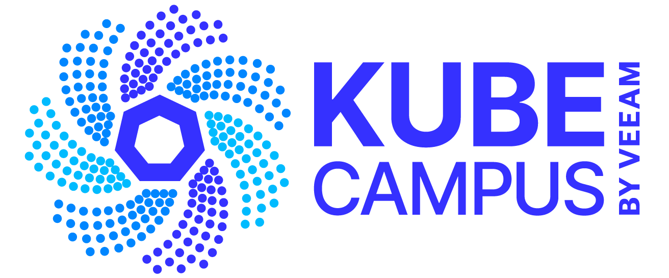
Logo
The KubeCampus by Kasten logo is a combination of the “KubeCampus By Kasten” text along with the heptagon swirl symbol. The logo text should always appear with the heptagon swirl symbol as shown to the right. The logo should not be used in any other colors other than the specified primary colors or alternate colors of black, gray and white. The logo with the color symbol and white text should only be used on black backgrounds. The solid white logo is for use on all other color backgrounds.
Primary logo colors
Website favicon
The KubeCampus favicon is the symbol from the KubeCampus logo in the primary colors. Occasionally, if needed, it can be in black. It should never be used in any other colors.
Minimum clear space
All versions of our logos have been designed to stand out from their surroundings. To ensure that they do, they must always be contained within an area of clear space. The minimum clear space around our logos should be equal the height of the distance from the top of the K to the top of the logo symbol.
This ensures that the area of clear space is proportional to the logo regardless of its size. Whenever possible all versions of our logos should be placed within a greater than minimum area of clear space for maximum visibility.
Minimum clear space is equal to the height of the space between the top of the K and the top of the symbol.
Minimum clear space is from the outer edges of the logo area as indicated with the guidelines.
Minimum size
All versions of our logo can be reproduced in a wide variety of sizes with the minimum size set at 30.48mm/1.25in for print and 150px for web to ensure visibility and legibility.
Minimum size print: 30.48mm / 1.25in
Minimum size web: 150px
Secondary Logo
The vertical KubeCampus logo is for use in certain instances such as on swag and certain social media banners such as Instagram banners.
Incorrect logo usage
The KubeCampus by Kasten logo should never be used in any other colors than the approved branding colors.
The KubeCampus logo should never be used with a gradient fill.
The KubeCampus type should never be used without the “by Kasten” type.
The KubeCampus favicon should never be used in any color other than the primary branding colors.
Color Palette
The primary colors are the 3 colors used in the KubeCampus logo. Daffodil is used for highlighting text. Rouge is used sparingly for certain elements in diagrams and info graphics. Graphite, the neutral colors is used for when the logo appears as a solid gray and can also be used in diagrams, info graphics and tables.
Typography
Guardian Sans is our primary typeface for headline and display use. It is to be used across all of our print and digital communication materials, from sales collateral and publications to our web site and other multimedia applications.
The various weights of Guardian Sans, shown below, can also be used for headlines as well as highlighting and emphasis, subject to approval by our communications department.
